
Microsoft Excel, a widely used spreadsheet application, offers a myriad of tools and functionalities for data analysis and visualization. One such powerful tool is the ability to create histograms. Histograms in Excel allow users to visualize the frequency distribution of a set of continuous or categorical data. This representation can be invaluable for researchers, students, business analysts, and anyone seeking to better understand the patterns and trends within a dataset.
Before diving into creating a histogram, it’s crucial to ensure that your data is appropriately prepared. This means organizing your dataset in a way that is conducive to histogram creation. In Excel, it’s advisable to have your data sorted in ascending order, although it’s not a strict requirement. It’s also important to consider whether you will group data into bins beforehand or allow Excel to determine the bin intervals automatically. Pre-defined bins can offer more control over the granularity of the histogram, but if you’re unsure about the intervals, Excel’s automatic binning can be quite handy.
To construct a histogram, you’ll typically utilize the “Charts” feature found under the “Insert” tab. Excel’s intuitive interface guides users through the process, making it relatively straightforward even for those not well-versed in data visualization. Once you’ve selected the histogram chart type, you simply need to input or select the range of data you wish to visualize. The application then crafts a histogram, providing a graphical representation of your data’s frequency distribution.
However, as with any tool, there are nuances to be aware of when using Excel for histograms. One should be mindful of the bin width, as inappropriate binning can skew the interpretation of the data. Moreover, after creating a histogram, it’s always a good practice to review and, if necessary, refine it. You might need to adjust the axis labels, modify the color scheme, or make other aesthetic tweaks to ensure that your histogram not only accurately represents the data but is also easy to interpret and aesthetically pleasing. Following these steps and best practices ensures a more effective and insightful visualization of your data in Excel.
Excel Example
First, you will need to create a frequency table that lists the category headings and a corresponding column that contains the frequencies for each category. For example, let us say a political scientist is interested in political party preferences for a local election.
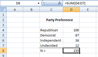
Next, you will highlight both the labels and the frequencies. Under the Insert tab, find charts and select column. For a traditional look, select the simple two-dimensional chart listed first. Once the graph is generated, you can right-click on it and edit the legend.
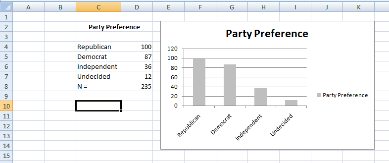
Once you have your chart formatted as you want it, you can right-click on it, select copy, and then paste it into a Word document. This is how you would present your chart in a research report.
A Note on Pie Charts
Note that pie charts can be effectively used in the criminal justice system to display similar data to bar charts. When dealing with a limited number of categories or levels of a variable, pie charts can be just as impactful or even more so. They can display both quantitative or qualitative data, revealing the distribution of data across different segments. For instance, let’s consider Detective Smith, who is analyzing the types of crimes reported in a specific precinct over a month. The primary crime categories are Assault, Theft, Vandalism, and Fraud. By creating a pie chart, Detective Smith can provide a visual representation to the department heads, illustrating which crime types are more prevalent and the proportion of each crime relative to the total reported incidents.
Understanding Pie Charts
Pie charts are circular graphs divided into segments, with each segment representing a portion of a whole. In the realm of criminal justice, they can be utilized to provide a clear visual representation of how different crime types or other related categories are distributed within a given data set. The entire circle represents the total number of cases or incidents, and each slice corresponds to the proportion of each type. The larger the slice, the greater the share it has in the total.
Interpreting pie charts is straightforward. By examining the size of each segment, one can quickly discern which categories are more prevalent. In our earlier example with Detective Smith, if the “Theft” segment occupies a significant portion of the circle, it immediately indicates that thefts are a major concern in that precinct for the given time period. Additionally, many pie charts, especially those generated using tools like Excel, come with percentage labels, further aiding in precise interpretation.
Generating Pie Charts in Excel
Creating a pie chart in Excel is a simple and intuitive process:
- Data Arrangement: Begin by organizing your data in a table. Using our example, one column might list the crime categories (Assault, Theft, Vandalism, Fraud) and the adjacent column the corresponding number of incidents.
- Select Data: Highlight the data you wish to include in your pie chart.
- Insert Pie Chart: Navigate to the “Insert” tab on the Excel ribbon. Click on the “Pie Chart” icon and choose the type of pie chart you want, be it a regular pie chart, a 3D pie chart, or even a doughnut chart.
- Customize: Once inserted, the chart can be customized by adding a title, adjusting colors, inserting labels, and more.
Pie charts generated in Excel can be further enhanced with features like data callouts, exploded slices (to emphasize a particular segment), and percentage values. While they are an excellent tool for showcasing proportions, it’s essential to ensure the data set isn’t too large. Pie charts are best used when there’s a limited number of categories to avoid clutter and maintain clarity. In contexts like criminal justice, they can serve as a valuable tool for quick visual comparisons and trend identifications.
Summary
Microsoft Excel provides a range of tools for data visualization, including the capability to create histograms to visualize the frequency distribution of a dataset. To prepare for a histogram, ensure your data is sorted, preferably in ascending order, and decide if you want to group data into predetermined bins or let Excel choose automatically. To generate a histogram:
- Organize your data, ideally in ascending order.
- Navigate to the “Insert” tab and choose the “Charts” feature.
- Select the histogram chart type.
- Input or select the data range for visualization.
After creation, it’s essential to review and potentially refine the histogram for clarity and accuracy, paying particular attention to bin width and chart aesthetics. This ensures your histogram is both accurate and easily interpretable.
Last Modified: 09/25/2023