
A guest on CNBC’s Power Lunch today (09/18/2018) argued that this phase of the bull market is different than similar past markets of a certain age was that this time “there is no irrational exuberance.” I take issue with that assertion. Nio, a Chinese electric car maker, IPOed at $6.00 and went up over 100% in the space of a couple of days. This despite analysts starting the stock with a sell rating and a price target below the IPO price. New rounds of tariffs on around $200 Billion in Chinese goods were levied by the president, and the DJI rose nearly a full percent the next day. The media seems to have forgotten that we already have tariffs on several of our allies from earlier in the President’s term. Tariffs are by definition inflationary, and they disincentivize consumer spending and investing.
The Fed is hiking rates, and bonds have hit the 3% level once again. The dollar keeps strengthening much to the chagrin of gold investors. One official stated that China “was out of bullets” in the trade war since they didn’t have much else that they could put tariffs on. This ignores the several nuclear options, such as dumping billions in US bonds and devaluing the Yuan such that the tariffs don’t really harm Chinese businesses and consumers. This will would have a domino effect, and many world currencies would lose strength. That would, in turn, cause the dollar to strengthen even more. These are all headwinds to corporate earnings, and tailwinds have already been priced into the market. Many investors have adjusted their portfolios to reflect some risk aversion, but holding 5% cash while bidding up the S&P 500 to insane levels does not reflect real caution.
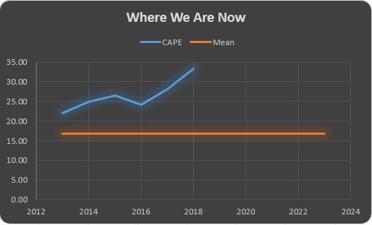
The venerable Professor Schiller of Yale (the economist who coined the phrase “irrational exuberance”) has pointed out on several occasions that the CAPE ratio (currently at 33.27) is very high compared to the average (mean = 16.57). To get a feel for what that looks like visually, examine the chart below:
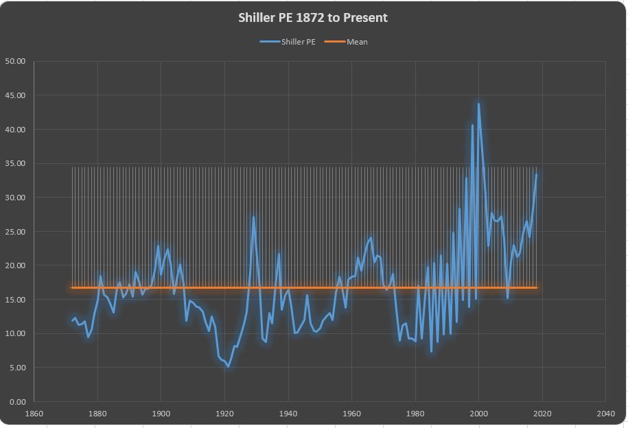

The blue line represents Professor Shiller’s inflation-adjusted P/E ratio (CAPE) over 138 years. The vertical hatch marks represent 2.58 standard deviations above the mean, which means that any part of the blue line sticking up above those hatch marks represents a very high and statistically unlikely level for the CAPE. About 99% of the time, multiples have been lower. As we can see from the chart, only the Dot-com Bubble era had a higher degree of irrational exuberance than we do today. In absolute terms, P/E ratios may seem reasonable (only 16x next years projected earnings), but when we examine them in the historical context on a cyclically adjusted basis, we see a different picture emerge. We’re just a few bullish days away from rejoining the illustrious 1% club of ridiculously stretched multiples. “Things aren’t as silly as they were during the Dot-com Bubble” is no evidence that we are not overextended now.
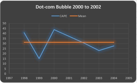
Interestingly, the period of the dot-com bubble had a mean CAPE of around 30. That means that average CAPE, even including the big crash, was higher than most of even the extreme scores of all other periods. If we look at the CAPE where the market bottomed out in 2003, we can see that multiples were only slightly stretched. It was still high in reference to the historical average. Logic dictates that when values are more than double the historical average, a 50% downturn results in values that are near the historical average. Market performance during the dot-com bubble was far more irrational than in any other period.

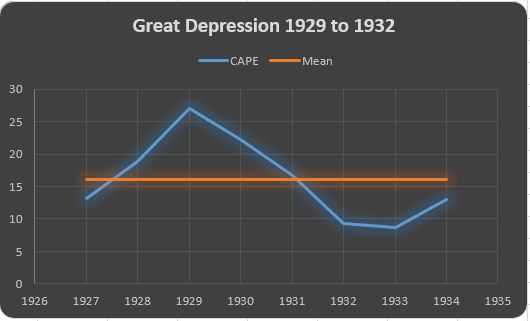
Most other bull markets followed a very similar trend. Multiples climbed high above the mean and then fell back through the mean. What makes the dot-com bubble so spectacular was the height of the mean during the time, and not the pattern of rising and falling. In the chart for the Great Depression, we can see that a boom period was followed by a rapid downward move that lasted nearly four years.

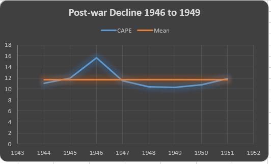
When World War II ended, euphoria was the norm, and the thrill of victory swept the nation. Thousands and thousands of returning soldiers wanted to start families and live the American Dream. A year after the War had ended, the economic reality of massive spending and massive destruction started to hit home, and equity values slipped. The mean CAPE of the period was already lower than the historical averaged, that translated into a gentle drift downward in contrast to the massive and protracted sell-off of the Great Depression.

The early sixties was a period of social turmoil inside the United States, and it was filled with Cold War intrigue and geopolitical risk. The Bay of Pigs Invasion and the nuclear fears of the time were on the minds of all Americans, including investors.
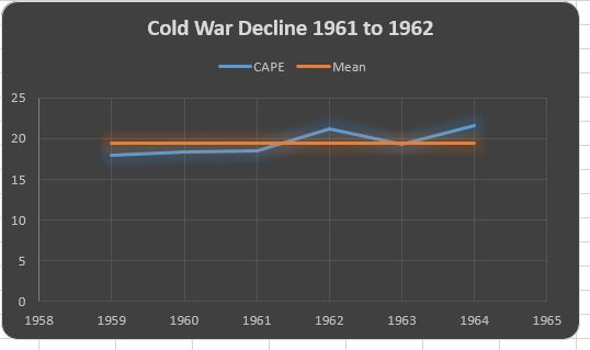

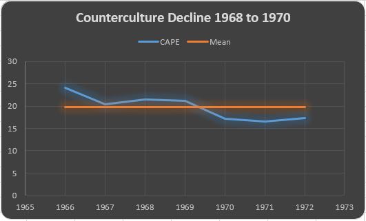
The end of the 1960s saw a resurgence of social upheaval, and the civil rights movement was at its zenith.
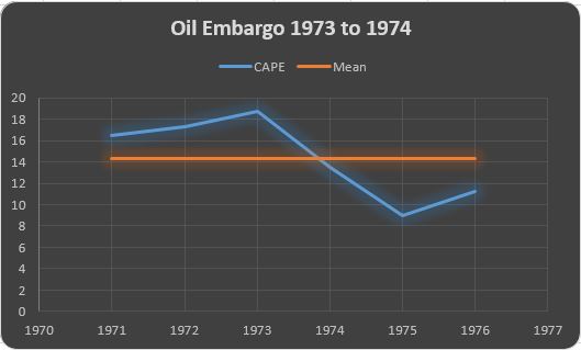
Energy is the lifeblood of the economy, or at least it as in the early 1960s. Conflict in the Middle East followed by an Arab Oil Embargo did massive damage to Western economies between 1973 through 1975. In this case, the mean of the period was near the historical average and the high point in 1973 wasn’t all that stretched. The downturn would take multiples well below the historical average.

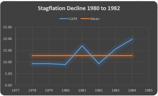
1980 to 1982 marked a time of fiscal nightmares for the government and people of the United States. The end of the Carter administration saw very high inflation, very high interest rates, and very slow growth. The bear market ended with the election of Ronald Reagan, after which the market took off with a vengeance.

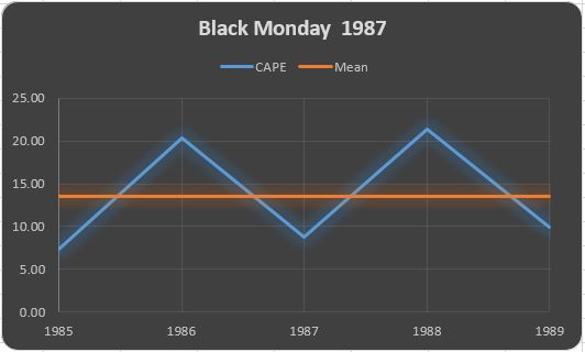
Black Monday is rare in that a single day was the focus of a shockingly fast decline in the markets. The DJI shed 26.6% on that one day. Overall, the bear market lasted only three months, but the S&P 500 shed 33.5% during that short period. This chart is very instructive since it serves as a good example of the range of multiples (inflation adjusted) that stocks usually trade within.

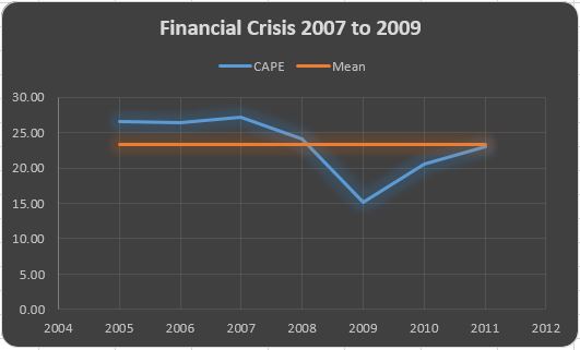
The financial crisis happened during the middle of an elevated period of market valuations and multiples. Investors were euphoric, and the Wall Street bankers had gone insane and took on an appalling level of risk. Euphoric borrowers applied for the biggest mortgages that they could get, and underregulated banks handed out huge checks to borrowers that didn’t have a prayer of paying them back. Real estate markets were on fire, and the wisdom of the day was that property values would appreciate so fast that leverage and a positive attitude were all you needed to get rich. That worked well until 2007 when uneducated mortgage borrowers owed bankers focused on short-term profits, and that influx of risk caused the bankers to sell off that risk with financial instruments that they little understood.
From the above charts and commentary, we can see a pattern in how bull markets die. While the nominal cause of the downturn varies, we usually find geopolitical risks, fiscal risks related to credit cycles and tax structures, and domestic strife in the list of hypothetical causes. We also find some fairly predictable numerical patterns. The idea of “reversion to the mean”, also known as regression, always seems to be in play.
Any time the CAPE is below the mean of 16.5, we can invest knowing that the odds are very good that markets will move upward. About two-thirds of the time, CAPE ratios will move between 10 and 23. When we get outside of those ranges, we can expect a move back toward the mean. When scores become very distant from the mean, the tendency is to return to the mean in short order.

Given the “sideways price action” of recent weeks, it seems that investors are worried about trade wars and other geopolitical risks. They are worried about stretched multiples, but not so worried as to get out of the high flying stocks that have kept the bull market alive for this long. Given the level of the CAPE over its historical average and the lack of response to dangerous economic headwinds, I believe that we have enough evidence to call today’s level of exuberance irrational. The problem for more rational investors is that we have no way of knowing when the madness will end. History teaches us that the stretched multiples tend to snap back toward the mean like a massive rubber band–the further it gets from the point of origin, the more powerfully it snaps back. When a sufficient catalyst does occur to strike fear into the hearts of market revelers, the downfall will likely be as fast as it is dramatic.
Not familiar with the normal curve and where the percentages discussed above came from? Check out my book chapter to learn more.
[amazon_link asins=’0691173125,069114592X,1717736831,B00G2DM52U’ template=’ProductCarousel’ store=’thereferencepage’ marketplace=’US’ link_id=’85cdbde2-bb9e-11e8-b30e-cf503b9adbf4′]